|
04-12-2012
|
1 |
|
Dark Desert Fox
Join Date: Sep 2011
Location: United States, Ohio
Posts: 5,720
|
Need Art Advice
Recently I decided to get back into art. I like to draw on paper and then trace it on the computer using Photoshop CS5 and then start coloring it. The first thing is what settings or tool should I set my paint brush or pencil to make it as smooth as possible? I also wouldn't mind some good Photoshop brushes that I can use for effects like snowflakes, stars, etc. I attached a picture I made with the current method I'm using. I feel it could do better using some new tools and methods.
 |
|
04-13-2012
|
2 |
|
Bazinga
Join Date: Dec 2011
Posts: 575
|
Great work! <3
|
|
04-14-2012
|
3 |
|
Dark Desert Fox
Join Date: Sep 2011
Location: United States, Ohio
Posts: 5,720
|
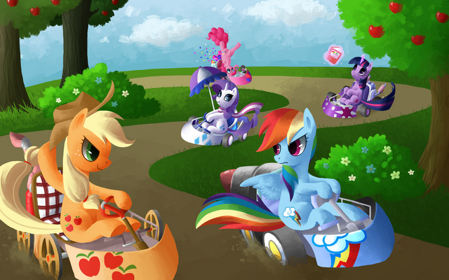
Thanks :o. I want my stuff to look like this: http://images5.fanpop.com/image/photos/25300000/Pony-Kart-my-little-pony-friendship-is-magic-25333956-640-400.png (Unsupported image host) It's nice and smooth while mine's the opposite. I don't know what kind of techniques people use for digital art, but I would sure like to know some. I've tried YouTube and it's kind of hard to find the one's that I had in mind. |
|
04-14-2012
|
4 | |
|
Registered User
Join Date: Sep 2011
Posts: 266
|
|
|
|
04-14-2012
|
5 | |
|
Dark Desert Fox
Join Date: Sep 2011
Location: United States, Ohio
Posts: 5,720
|
|
|
|
04-14-2012
|
6 |
|
Guest
Posts: n/a
|
Firstly, there are parts of that image, such as the tail of the pony that are pillow shaded. this would be fine if the light source is directly in front of them but that would mean everything else has to be shaded the same way. secondly, either your outlines are too heavy, or you should just use shades to define the limbs and details of the pony. as you can see in the image you like a lot, there is no heavy outlines at all, thus removing a cartoony aspect. Thirdly, your shades are all too close together, don't be afraid to have large changes in shades, it really compliments the lighter colors and helps define your light source a lot better.
|
|
04-14-2012
|
7 |
|
Who knows?
Join Date: Apr 2012
Location: California
Posts: 1,716
|
nice work.
|
|
04-14-2012
|
8 |
|
Banned
Join Date: Sep 2011
Location: New Hampshire, United States
Posts: 3,135
|
He's asking for advice not praise...
|
|
04-14-2012
|
9 | |
|
Dark Desert Fox
Join Date: Sep 2011
Location: United States, Ohio
Posts: 5,720
|
Thanks! |
|
|
04-14-2012
|
10 |
|
Registered User
Join Date: Dec 2011
Location: Blacksburg, Virginia
Posts: 5,459
|
Why is wheatley flying with a pony with balloons on his butt? Anyways, nice! |
|
04-14-2012
|
11 |
|
Dark Desert Fox
Join Date: Sep 2011
Location: United States, Ohio
Posts: 5,720
|
|
|
04-14-2012
|
12 |
|
Registered User
Join Date: Dec 2011
Location: Blacksburg, Virginia
Posts: 5,459
|
Looked like wheatley from portal 2 <3
|
|
04-14-2012
|
13 |
|
Banned
Join Date: Sep 2011
Location: New Hampshire, United States
Posts: 3,135
|
|
|
04-14-2012
|
14 |
|
Quack Quack~
Join Date: Sep 2011
Posts: 1,810
|
A job well done
|
|
04-14-2012
|
15 |
|
what the heil
Join Date: Nov 2011
Location: powerrangerville
Posts: 1,351
|
I don't know a lot about Photoshop painting, but I do know that a lot of illustrators like to use a cross between Illustrator and Photoshop in their work. Illustrator gives you that smooth, clean edge really easily, and Photoshop is good for the painting aspect. I don't know exactly how these artist interchange between the two or their techniques, but perhaps something to look into. Edit: LOL WHEATLY. awesome xD |